
We all know English language. Some knows it better than others, some worse, but it is mandatory to be able to explain your ideas and to understand other people’s ideas in the universal language of IT community.
However, for most of us English is not a native language and we have to make some sort of inner translation in our minds before we get the idea. We tend to watch localized movies, read articles in our native language, use localized manuals for household appliances and so on. We tend to use localized software, too, but only if it’s nicely localized – and this is where I come to my point:
nicely localized UI is the one that makes a user believe that application was originally developed for his language.
What do I mean here?
Well, nobody wants to convert pounds into kilograms, miles into kilometers, feet into meters. So as no one wants to guess what the “04” means in 04/01/2015 – April or 4th. That is pretty obvious. But also nobody wants to guess what the author of the localization meant when a UI element (a control or a menu option) is referred to using two different terms in two different places (f.e. in a message box and in the menu itself). This is very misleading, especially in an error message situation where user is under a lot of stress already. However error messages are often poorly translated or not translated at all. This situations could be avoided if several precautions were considered in the process of localization.
Much has been said about software localization already and here are some ideas that came from my experience. I had to localize (from English to Russian) an application that has nearly 1.5k unique messages, keys and terms that had to be translated. Application is still developed so I have to come back to this task from time to time. Here are the ideas:
1. Naming convention is a must.
Translate core functionality using clear and understandable terms and stick to these terms further on. Do this as early as possible and try to foresee possible changes and innovations so that you won’t have to change the translations in future versions.
2. When in doubt – refer to specialized translation sites

When in doubt… C4.
2.1 https://www.microsoft.com/Language/en-US/Search.aspx
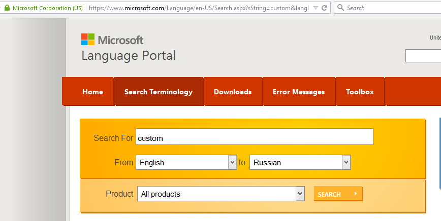
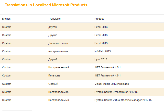
This one is particularly useful because it gives a scope of possible translations that were already implemented in live products that are used by millions.
2.2 http://www.multitran.ru/
Simply a nice site with lots of translation options to choose from for each term.
2.3 http://www.lingvo.ua/ru/Translate/ru-en
Free online interpreter from ABBYY. Translates text word by word.
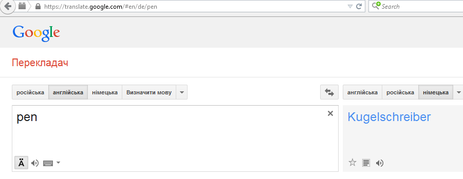
2.4 https://translate.google.com/#en/ru/
Of course this one we all know – Google translate can be used both for single words and for phrases. However avoid direct copy/pasting because most of its translations wouldn’t pass Turing test.
3. Reserve space or make UI stretchable to fit translations in all supported languages.
When application supports several languages all UI elements and menus have to be created in a way that allows long terms to fit there. German is particularly “well-known” for its long terms.
4. Avoid using geek terms.
Common language is better overall. Think about the end-users of the application – not all of them may be familiar with its domain or even with common software terms. Use sites that offer lists of synonyms in case a word or a phrase sounds too robotic or unnatural.
5. Highlight crucial confirmations.
Making message boxes modal is not the only way to get user’s attention. Some UX design authorities vote against usage of modal windows overall. This is speculative, however, that user rarely reads anything – is not.
User rarely reads anything.
I recommend taking a quick glance on this short cycle of articles about UI design. It was written around 2000 and is still pretty actual.
However, back to the point. Because user doesn’t like to read, especially long phrases – it is crucial to get his attention when some critical changes to application state are to be made.
Among them:
- Quitting without saving the data;
- Turning software or hardware into inoperable state (especially permanent);
- In general any important irreversible changes of application state.
To make a user react to this using only the text we have to highlight it using exclamation points (!), warning icons and sometimes even CAPS LOCK (oh my).
It is important to make the message short so that user actually reads it.
Example: “CAUTION! Proceeding will permanently erase all user data for current profile! Make sure to save a backup.”
6. Use specialized software for translations management.
When the number of used keys grow (and it will) maintaining translations can be a nightmare if corresponding applications are not used (such as Qt Linguist).
In conclusion – it’s nice to remember that the UI is the part with which a user actually interacts and he won’t be able to (or wouldn’t want to) check out the mighty power of applications’ algorithms and its highly optimized 🙂 code if he gets distracted and frustrated by poorly localized or misleading interface. This could be easily avoided if you keep all things stated above in mind while trying to make user experience a bit better via nice localization.
Author: Igor Kalinovskii